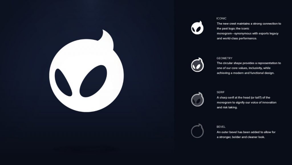
Yesterday, Dignitas announced that they are rebranding fully, and changing their appearance. This is what their new logo looks like:
Dignitas rebranding – Origins
Many Dignitas fans felt nostalgic after seeing the newest rebrand due to the original logo being so iconic. When they first announced their rebrand back in 2018, many felt shook and outraged that they would change such a logo. Nevertheless, the Owl was loved by huge fans of Dignitas, and overtime it felt like it truly was a part of Dignitas.
One of the best parts of this rebrand is that Dignitas are choosing to keep their Black and Yellow layout.
New logo
With this rebranding, Dignitas paid homage to the Evil Geniuses rebranding, where they went into detail on what their logo meant.

This is what their management had to say about the rebranding:
“The return of Digi is a thrilling moment for the entire Dignitas organization and one we’re confident will excite our current fan base while reengaging idle fans that have long awaited the return of a legendary icon. The reimagined Digi is an original emotive mascot to the world of gaming and esports that will stimulate storytelling and emotional narratives, while becoming an asset unique solely to Dignitas.“
Source
Here in 2021, we’re seeing a lot of teams and organizations rebranding, which is actually for the better. A new year means new beginnings, and we cannot wait for what Dignitas has in store for us this year.
Make sure you keep yourself updated on www.esportsguide.com for all your esports news!


