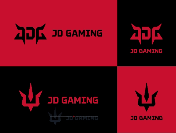
Yesterday, popular Chinese organisation JD Gaming opted to reveal their newest rebrand. Here’s everything you need to know:
JD Gaming reveal rebrand – What’s different?
As can be clearly seen, this new logo is mainly represented through letters. Much like other rebrands prior, JD Gaming are going for a much simpler logo, using only text, numbers and letters. They have removed the ‘Demon’ mascot logo, and even though they removed it, they’re still trying to have it represented through letters. Here’s a quick look at some of their new designs:

Along with this logo change, there will also be an update toward their current esports jerseys. However, they are still yet to show what they would look like.
Community Reaction
Overall the community felt shook by the change as it was very unexpected. However, the JD Gaming fan base realises that if the organisation has plans to expand, having a demon behind the logo is not the best way to portray themselves.
Time and time again we’re seeing these big organisations go for a more simplistic approach. Some would say we’re taking the traditional sport route, as some of those big clubs have also transferred to simpler designs.
Visit www.esportsguide.com for more esports news!

