Ninjas In Pyjamas have finally opted to reveal their first ever rebrand since the organisation’s establishment. Here is their video announcement:
A brief look at the rebrand
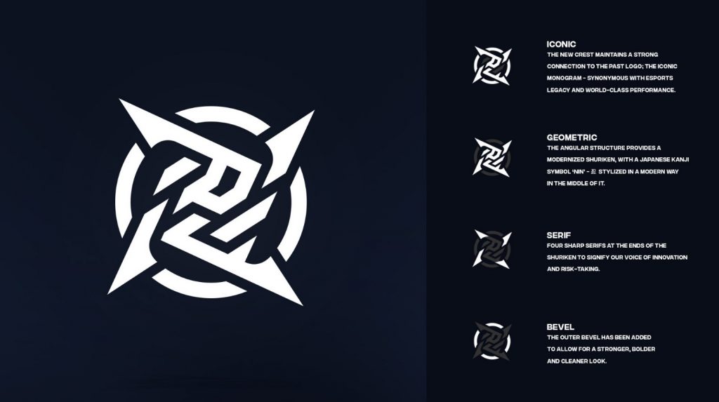
In the video we can clearly see that the Ninjas are going for a more urban and street-like look. The logo itself represents a shuriken, which is obviously related to their name. However the colour they are going for constitutes a more vibrant outlook on their brand. With this change they’re obviously going for a much simpler look, showcasing the true meaning of being a “Ninja” within NiP.
Ninjas In Pyjamas rebrand – Community reaction
Obviously everyone took it as a shock. The iconic Ninjas In Pyjamas logo has been used since the year 2000, and its iconic look and colour were unique. Prior to previous rebrands related to CS:GO, NiP have also decided to release the inspiration for their new logo:

Some have also expressed their feelings regarding the new colour scheme that NiP will be following. The new neon green is something that no one expected, in fact, some have decided to switch the colour of the new logo to the old one to see how it looks.
2021 has been filled with rebrands and new looks for esports figures and teams. Some of the most notable ones are Damwon Gaming, Dignitas, and Rogue. This is certainly going to be a new chapter for NiP and its fans, and it will be very exciting to see what they can do all throughout this year.

