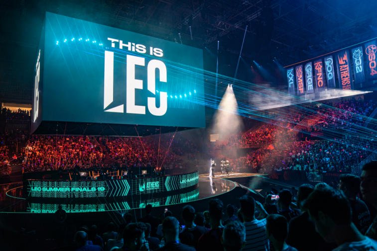
Yesterday, the Spanish organisation Vodafone Giants announced it’s rebrand and new look for 2021. Here is their announcement:
Vodafone Giants Rebrand
If you’re an avid twitter user and follow the team, you’ve probably realised a couple teases during this past week. This new logo has a more modern and simplistic layout than the one prior. The blocky style type in logos has become very popular in esports and we’re yet to see a whole lot more of it in the near future. Believe it or not, this is the organisation’s third rebrand. Their most recent one was when they announced their huge partnership with Vodafone.
Here’s a logo comparison from before the rebrand, and after:
New Logo
What about jerseys?
With this rebrand, Vodafone Giants have created new jerseys and new outfits for all their players and fans. They are keeping the same colours and layout as their previous one, but the logo has been changed. Here’s a quick peek of how it looks:
We’ve seen loads of rebrands already in 2021, and most of them have turned out to be accepted by a majority of the community. Hopefully this rebrand helps the organisation expand and grow further in the industry.
Visit www.esportsguide.com for more esports news!


